
The key 5 mistakes in customer journey mapping
The five customer journey mapping mistakes that turn a useful map into a poster, why each one happens, and what to do instead on your next map.
The key 5 mistakes in customer journey mapping
The five mistakes that ruin most customer journey maps are: mapping your own process instead of the customer's journey, drawing the official route instead of the real one, making one map for everybody, giving every step equal weight, and stopping at the surface where nobody owns the cause. Each produces a map that looks right and changes nothing.
New to journey maps? Start with a journey map that leads to change, not a poster. This piece is for the second map, after the first one disappointed you.
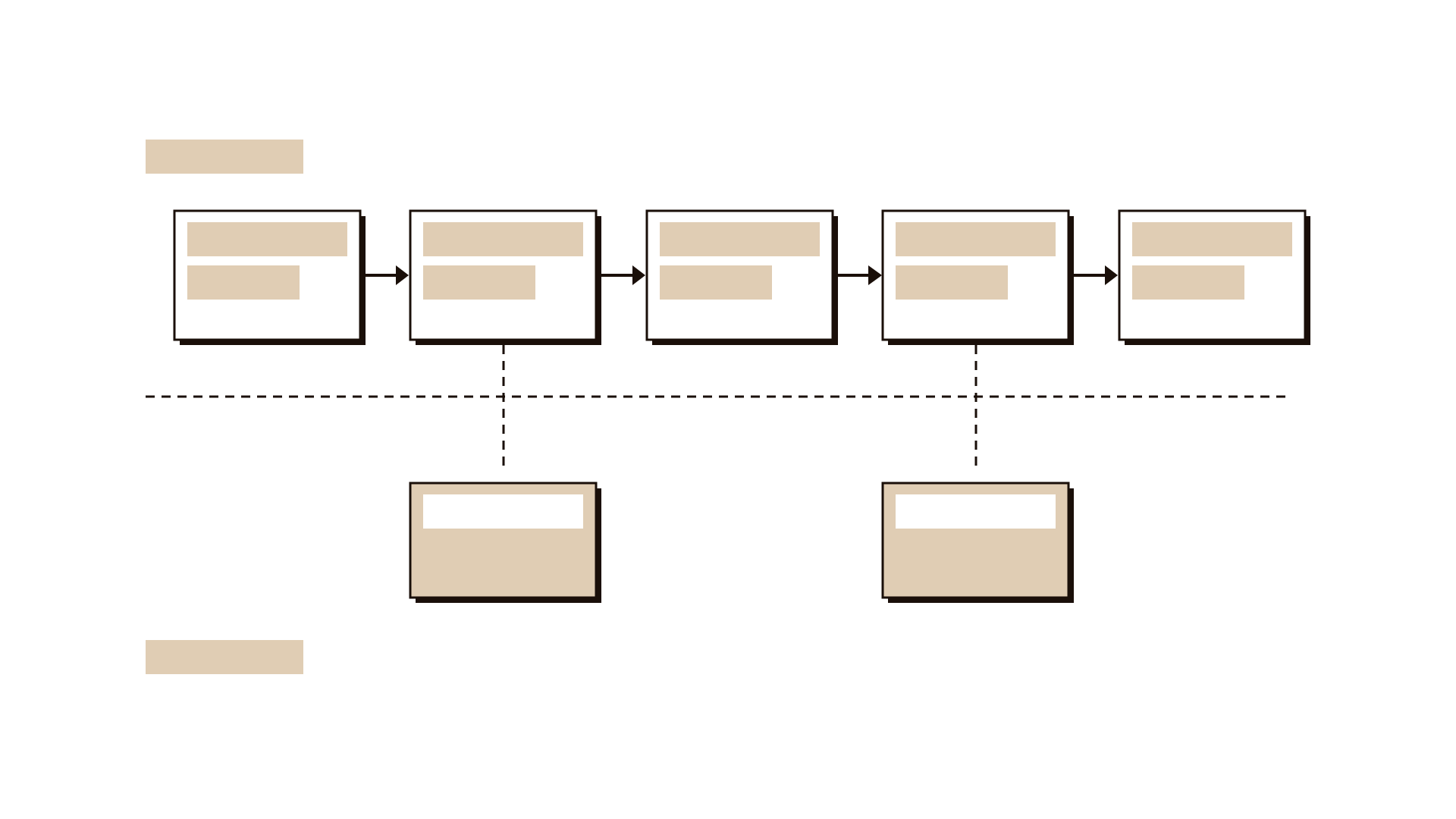
1. You mapped your process, not their journey
The stages on the map are your departments wearing customer clothes.
If the column headings read "Application", "Verification", "Approval", you have drawn your workflow and written the customer's name above it. Customers do not experience verification. They experience waiting and being asked for the same document twice.
It happens because the people in the room know the process best, and because the map starts at your front door. Real journeys start earlier, when the person realises they have a need, and end later, when they find out whether the outcome worked.
What to do instead: name the stages in the customer's words, as things they are trying to do: "find out if I qualify", "get my papers together", "wait to hear", "use the money". Start the map at least one step before anyone contacts you, and end it one step after you consider the case closed. A stage that only makes sense to staff belongs on a service blueprint.
2. You drew the official route, not the real one
The map shows the journey as designed, not as lived.
Every service has the route in the procedure manual and the route people actually take. The real one includes workarounds: calling the branch because the app is unclear, asking a friend who did it last year, printing a form meant to be digital, coming back because one signature was missing. That is where most of the cost and frustration sit, and a map drawn in a workshop from staff knowledge never shows it. The emotion line gets filled in the same way, from imagination.
What to do instead: before you draw, watch the journey happen: sit at the counter, listen to calls, try the service yourself as a stranger would. The contextual observation and service safari guides show how. Speak to people who recently completed the journey and to some who gave up. Mark every workaround in a different colour. If the map has no workarounds, you have not looked hard enough. Our sibling article on how to really understand your customers covers the research in depth.
3. You made one map for everyone
An average customer has an average journey, and nobody actually has it.
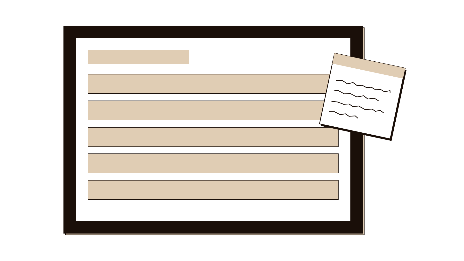
One map is easier to present, but it smooths away the moments you need to see. A first-time applicant and a returning one, someone applying for an elderly parent, someone on a phone rather than at a counter: their worst moments fall in different places. Averaged, every low point looks moderate. The same mistake leaves out people at the edges, such as those with a disability or using a second language. Services often break there first, and fixing for them usually helps everyone.
What to do instead: define who the map is for by situation and goal, not by demographics, and make one map per meaningfully different journey. If you use personas, pick one per map and write its name at the top. When you are unsure whether two groups need separate maps, compare where each one struggles. If the hard moments fall in different stages, split the map.
4. You gave every step equal weight
A map where every cell matters is a map where nothing does.
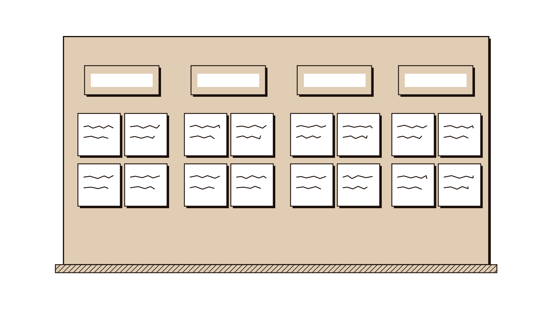
A finished map often has thirty pain points on identical sticky notes. The team tries to fix them all, or picks the easiest. Neither works. People do not remember a journey as the sum of its steps. Psychologist Daniel Kahneman and colleagues described what became known as the peak-end rule: people tend to judge an experience by its most intense moment and by how it ends, more than by its overall length or average. A long wait can be forgiven; one humiliating exchange at the end often is not.
What to do instead: after the map is drawn, choose the few moments that matter most. Good candidates are the points where people abandon the journey, the most intense emotional low, the ending, and any moment where a small failure creates a large cost later. Limit yourself to three. A touchpoint matrix shows which channel carries each moment. Then design deliberately for those moments, including the ending.
5. You stopped at the surface, so nobody owns the cause
The map shows where it hurts, but the reason sits behind the counter, and no one was invited.
A customer-facing map shows symptoms: "waited three weeks". The causes sit backstage: systems that cannot share data, a handover with no owner, a policy written for a different case. Stop at the customer's side and the fixes are cosmetic, such as more reminders or a friendlier letter.
If the people who own the backstage, such as IT, policy and front-line supervisors, did not help build the map, they will not recognise it as theirs.
What to do instead: for each of your chosen moments, trace the cause backstage. Ask "why does this happen?" until you reach something a named person can change. For the deepest cases, build a service blueprint; our comparison of journey maps and service blueprints shows when you need one. Finish every map with one owner, one date and one change per chosen moment. A map without an owned fix is not finished.
Do's and don'ts
Do
- Name stages as things the customer is trying to do.
- Start before first contact and end after you close the case.
- Mark workarounds and abandonment points in their own colour.
- Pick three moments that matter and design for the ending.
- Bring backstage owners into the room before you draw.
Don't
- Copy your process manual onto a customer template.
- Fill the emotion row from inside a meeting room.
- Merge different journeys to get one tidy slide.
- Treat thirty pain points as thirty equal priorities.
- Hand over the map as the outcome. The outcome is the change.
Illustrative example
Illustrative. A city council in Europe mapped how residents apply for a parking permit. The first map had five stages, from application to issue, one pain point each, and recommended a clearer web page.
On a second attempt the team corrected all five mistakes. They renamed the stages from the resident's side, starting with "I've just moved and got a ticket". Two days at the service desk revealed a workaround: residents emailing their tenancy agreement to a staff member they knew, because the upload failed on phones. They split the map in two, because residents applying for a visitor permit for a carer had a completely different and much harder journey. They chose three moments: the first ticket, the failed upload, and the silent week before approval. Backstage, the silent week turned out to be a manual batch check run once a week. The parking manager took ownership of moving it to a daily check, with a review in two months.
Questions people ask
What is the most common mistake in customer journey mapping? Mapping the organisation's internal process and labelling it as the customer journey. You can spot it when the stage names are department names. Rename stages as the things the customer is trying to achieve.
How many pain points should a journey map have? Record as many as the evidence shows, but prioritise no more than three. The value comes from choosing the moments that matter most and fixing them properly, not from the length of the list.
Can you make a journey map without customer research? You can draft one from assumptions as a starting point. Label it as a hypothesis and test it with real customers before basing decisions on it.
Where to go next
Use the experience mapping guide for the canvas, contextual observation to see the real route, and the service blueprint to reach the causes. For the wider picture of building customer-centred practice, read our pillar, customer-centric is a practice, not a slogan.